Pick of the day: Metalliville.com
This dedicated underground metal webzine has been around for some years now, and I had not visited lately, until today.
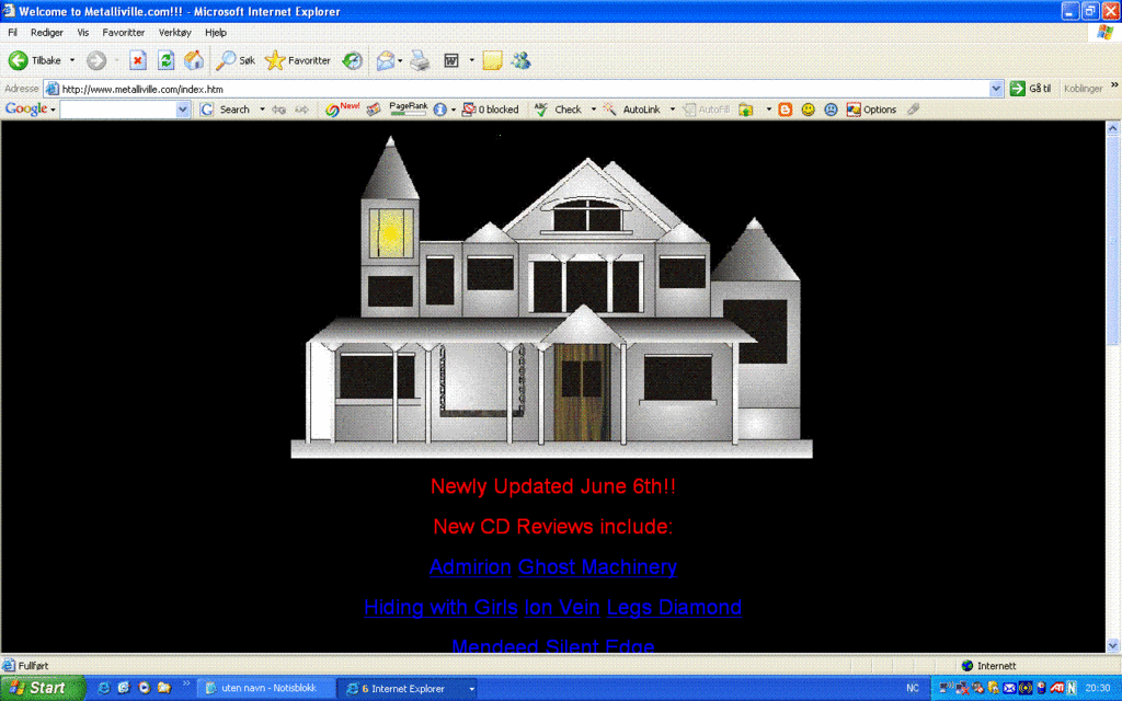
However, I noticed this bizzarre looking illustration on their homepage. Well, actually not on their homepage, because their first page, www.metalliville.com/index.htm, says "The UK's Finest 4ever Rock & Metal Webzine!..." You have to click the link to actually enter the page.
Then, this "art work" takes up half of my screen... There's no logo, no navigation, no nothing. I'm pretty sure this page brakes every usability rule ever made by mankind.
OK, I get it, Amityville, Metaliville. But seriously guys? That house aint that good looking.
Well, it certainly seems like a nice page, or what? I visited Metalliville while looking for a review of the latest El Caco album - "The Search". I did not find it, but I found a review of their second album, "Solid Rest".
Is it possible to rewrite this review and make it about the "art" on website?"Their debut 'Viva' was promising but their second release 'Solid rest' simply comes across like a handful of other albums in the stoner world. All in all, the truth is, is that it is rather depressing and miserable and won't really be appreciated unless you are new to the scene.
It's just chuggy guitars and has no originality to it whatsoever. This band can do better. The only song that really stands out is 'Mrs. Coma' - a quieter number that's like a different band altogether. 4/10 By Glenn Milligan, BA Hons CS"
Just a thought."Your art work was perhaps promising at first, but now it simmply comes across like a handful of drawings in the stoned world. All in all, the truth is, is that it is rather depressing and miserable and won't really be appreciated unless you are new to the scene.
It's just chuggy and has no originality to it whatsoever. You must do better. The only thing that really stands out is...uhm. ".
posted by Viss Vass at 8:53 p.m. permalink
![]()
![]()

0 Comments:
Legg inn en kommentar
<< Home